
Webassessor - SaaS for Online Test Delivery
Webassessor is a globally used SaaS platform for delivering online exams, enabling organizations to manage candidate registration, test delivery, and results seamlessly.
ROLE
DURATION
TEAM
UX Designer
10 weeks - 2023
10 engineers, product director and product owner
PROJECT ACCOMPLISHMENT
Achieved a 20% increase in candidates purchasing their exams.
PROBLEM
Candidates struggle with booking their exams
How can we simplify the exam booking process so candidates can complete it smoothly and without frustration?

SOLUTION
Redesign of the exam booking process
BEFORE

AFTER

PROCESS
Starting with Research: A Non-Linear Journey of Iteration and Discovery
Understand
Research
Start Ideating
-
Understanding the product features
-
Exploring tutorials for usage guidance
-
Investigating different account options and their features
-
Researching competitors to understand other options available
-
Consulting with the customer success management team to leverage existing data
-
Interviewing clients to identify pain points and gather insights
-
Exploring various design ideas
-
Prototyping
-
Sketches
Test & Iterate
Reflect & grow
-
Presenting designs to internal teams
-
Collecting and incorporating feedback
-
Reiterate
-
Tracking user behavior through Pendo
-
Gathering feedback from clients and developers
-
Providing support and necessary resources for developers
Final Design
-
Ensuring designs are pixel-perfect
-
Creating UI designs
-
Collaborating with developers for seamless implementation
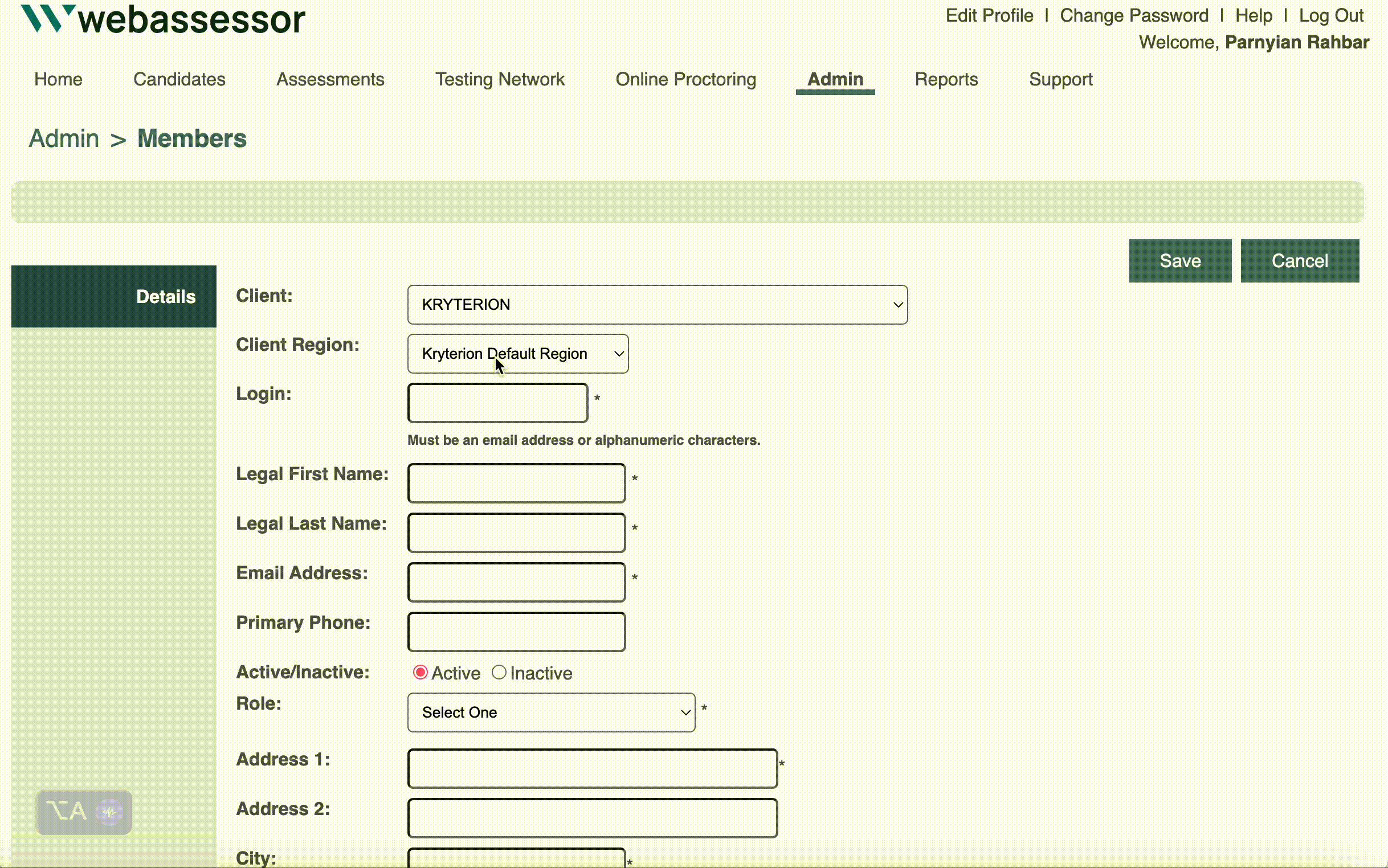
UX AUDIT
Reviewing the current flow to understand the painpoits
The first step I took was to go through the existing registration and exam launch flow to understand the pain points. I carefully documented each step to identify areas where users may encounter difficulties. This helped me pinpoint the exact stages where improvements were needed to enhance the overall experience.
Signing up for exams to understand the flow.
Documenting the steps

?
?
?

After reviewing the current flow, I had so many questions!
RESEARCH
1. Interviewed 4 Major Global Clients: Gaining Diverse Insights Across the U.S., Philippines, and South Africa
2. Market Research
3. Worked closely with CSM team to review the past data

PERSONA

-
Quickly find the exam she needs to register for.
-
Easily select a date and time that fits into her busy schedule.
-
Create an account and register without unnecessary steps or confusion.
Name: Emma JohnsonAge Occupation: Marketing
Tech Savviness: Moderate (comfortable with everyday apps but struggles with overly complex systems)
Emma, a busy marketing specialist, juggles work, freelance projects, and certification prep to advance her career. Her experience with the registration platform, however, has been frustrating and stressful.
ABOUT
GOALS
-
Struggling to find her exam quickly.
-
Overwhelmed by the clunky time and date selection.
-
Frustrated by the lengthy, disorganized account setup.
FRUSTATION
I created this persona to translate research data into a clear, relatable representation of my users
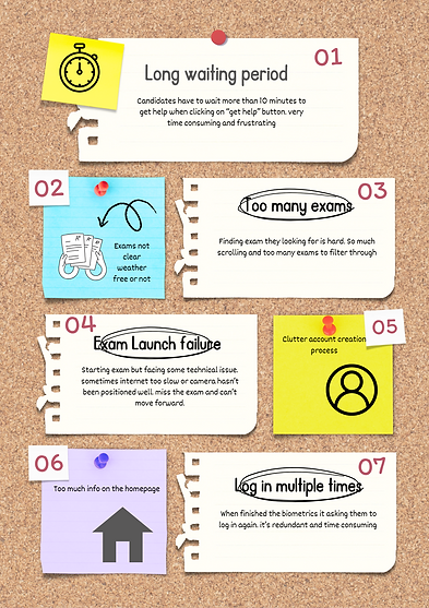
RESEARCH INSIGHT
-
Difficulty finding the desired exam
-
Candidates assume exam times are shown in their timezone, but they aren’t, causing confusion.
-
Lengthy and disorganized account creation process
REDEFINE PROBLEM STATEMENT
The above findings helped us further narrow down our problem statement, so we came up with our final design question:
How can we simplify exam booking so candidates can easily find their exam, select a date and time, and complete the process without frustration?
TASK FLOW
Created Task Flows to Visualize Every Step and the Bigger Picture

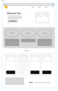
INITIAL SKETCHES
Getting design inspirations
Before diving into design, I analyzed the UIs of various test taking platforms. This helped me identify key patterns and features to integrate into our product, with a focus on creating a user experience that was visually appealing, casual yet professional, and highly functional.


3 Iterations on Time & Date Selection to Get Feedback from Engineering and Product Teams
I had several presentations with product owners, the engineering team, and clients to gather feedback. After each presentation, I would present again and reiterate a few times based on the feedback received.

Same Process for All Screens: Present, Gather Feedback, Iterate, Then Move to Final Design
Final Design
After presenting the designs to some of our biggest clients and executive team, I've started to focus on making designs pixel perfect, doing the final touches, and ensuring every detail is just right.
BEFORE
IMPROVEMENTS
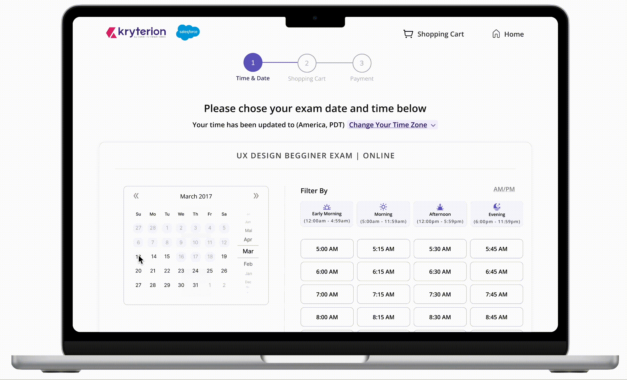
-
Offering distinct filtering choices for selecting preferred time slots
-
Effortlessly adjusting time zones according to user locations
-
Flexibility of adjusting the time zone and time format
AFTER
Shopping Cart Review Page
BEFORE

-
Conveniently going over the selected exams, removing an exam, or adding a new one
-
Minimize button redundancy by distributing them across different locations rather than clustering them all in one place
IMPROVEMENTS
AFTER
.png)
Checkout Page
BEFORE

-
Combining voucher and credit card options on a single page to reduce clicks and streamline navigation.
-
Combining two checkout pages into one, allows users to enter their credit card information and complete the checkout in a single click while reducing the number of pages.
IMPROVEMENTS
AFTER

Homepage
BEFORE

-
Improve the homepage by introducing diverse features and organizing information for enhanced purpose and clarity.
-
Create a friendlier atmosphere by incorporating illustrations, icons, and colors, and giving greater emphasis to the welcoming message.
-
Integrate a dedicated section for client information to maintain a smooth flow on the page without disruptions.
IMPROVEMENTS
AFTER

In-person Exams
BEFORE
AFTER

-
Capability to view nearby testing locations depicted on the map.
-
Employing filters for tailoring the city according to preferences.
-
Easily incorporating essential location details for convenient access and information on accessing the building

IMPROVEMENTS

Exam Catalog
BEFORE

IMPROVEMENTS
-
Enhanced filtering and search options for locating desired exams.
-
Clear visibility of exam delivery type and cost on the initial page.
-
Streamlined page layout with increased spacing and improved hierarchy.
AFTER


Login Page
BEFORE

IMPROVEMENTS
Enhance spacing and hierarchy while incorporating illustrations to create a warmer atmosphere and achieve a cleaner aesthetic
AFTER

Create an Account
BEFORE

AFTER
.png)


IMPROVEMENTS
-
Organizing the lengthy form process into three separate steps – the Webassessor questionnaire, client questionnaire, and terms and agreements – reduces cognitive load. Each step is shorter and more manageable, making it easier for users to navigate.
-
Incorporating language preference when creating their account allows us to display the content in their preferred language
IMPROVEMENTS
Used the term progressive disclosure where i presented less information on multiple pages, so users can comprehend things more easily.
METRICS- PENDO
I utilized Pendo to measure designs and track customer satisfaction, understand where users were getting stuck, and gather insights on their overall experience.
12% increasing checkout speed by
18% Reduced cart abandon rate
20% increase in purchasing their exams.
Challenges
A gesture considered positive in the U.S. might be offensive in another country.
CHALLENGE#1
Globally Used Complex Product with a Wide User Base
-
Conduct thorough research on cultural norms and gestures in target regions to avoid offense.
-
Gather diverse user feedback and test across cultures to ensure inclusivity.
-
Provide customization for cultural preferences and localize gestures and UI elements.

CHALLENGE#2
More than 300 clients who require customization
-
Offering customization reduces the need for extensive custom coding and ensures compatibility for all clients.
-
Facilitate weekly client meetups to gather feedback and address concerns.
Home page of 2 different clients look different causing more custom coding


A template that all clients can use

Outcome


LEARNING
Designs Are Influenced by Many Factors
Designing a product used by over 300 clients isn’t just about coming up with creative ideas—it’s about understanding the business goals, technical constraints, and the bigger picture. Without that balance, even the best designs can miss the mark. Taking a thoughtful, well-rounded approach is key to creating something that truly works.
Feedback & Effective Communication
I learned to adjust my feedback approach by starting with positive comments before addressing concerns. This makes feedback easier to accept and has improved collaboration with those more sensitive to critique
Pushing through work with positive mindset
When work becomes tough and time feels limited, maintaining a positive mindset is crucial. By staying positive and prioritizing tasks effectively, everything becomes more manageable
UX Impact
1. On clients (getting new clients) - Demonstrating to our clients our commitment to continuous improvement, showcasing our dedication to refining and enhancing our product offerings.
2. Engineering team - Helping the engineering team understand complex processes by not only designing but also breaking down the flow in mockups into simple steps (like A, B, C, and D) so they get it better. Instead of uploading all the designs at once, this way they can follow along step by step.
3. Eastethic - Enhancing the overall aesthetics and appeal of the product, aligning it more closely with our company's values and overarching purpose.
Here are some of the projects that I have worked on
.png)
Project#2
AI generator in creating an item
Integrating AI to streamline and expedite the process of generating questions and answers
1 Month long - worked closely with marketing and engineering team
.png)
Project#3
Session Review
Revamp the session review page to provide a comprehensive overview of an exam session, allowing users to access its details
2 Month long - worked closely with TDS team and product team
.png)
Project#4
Dashboard homepage design
Design the dashboard homepage to display the content that administrators use most frequently and create a more inviting and friendly ambiance.
2 Month long - worked closely with clients, marketing and engineering team